Beautiful Websites, Capulet Approved
Digital strategists pay a lot of attention to social media tools, digital tricks and marketing tips. But, we don’t always keep tabs on website design trends and evolution. Today we’re celebrating some of our favourite websites of 2013 and letting you in on why we think they’re so good.
Knock To Unlock
Knock is a smartphone app that lets you lock and unlock your phone, computer, or tablet by knocking on it, just like you would a door or tabletop. The website has almost no text and depends primarily on video, which reflects the app’s simple but clever concept. This is an example of a website that’s prioritized video over text and has integrated it seamlessly into the overall design concept in an original way. The downside? Depending on your internet connection all that streaming video may slow down the site’s load time.
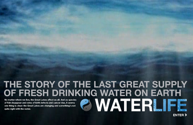
Waterlife
It’s hard to click away from a website that plays an inspired musical composition by auteur Brian Eno. Greeted with Eno’s “An Ending (Ascent),” an instrumental piece that evokes the feeling of floating, visitors move through gripping storytelling of the last great supply of fresh drinking water on earth. The National Film Board’s digital projects often hit it out of the park and this is no exception. WaterLife is a beautiful site that delights visitors while staying true to its advocacy mission.
Bear71
Another NFB project, Bear 71 is an award-winning website/documentary that elegantly marries digital advocacy, video storytelling and user interaction. Using sound, video and game-inspired features, visitors follow a grizzly bear in Banff National Park as she navigates a landscape that borders wild and urban areas. In 2012, Bear 71 won the Gold Cyber Lion Award at the Cannes Lions International Advertising Festival. Two years on, it’s still a compelling example of how to inspire an audience to action with online storytelling.
Rolling Jubiliee
The Rolling Jubilee is an infographic inspired website that packs a truckload of information–videos, graphics and copy–into a clearly presented scrolly site. The Rolling Jubilee raises money to purchase debt at pennies on the dollar and has already relieved nearly $15 million worth of debt. Though visually it’s quite a subdued website, it does a fine job of making complicated ideas and information bite-sized and digestible.
Slavery Footprint
This is a scrolly site that hits home. Slavery Footprint invites visitors to test connections they might have to modern-day slavery, based on current lifestyle and purchasing decisions. Take the survey and then move through the question tree by scrolling up, down and side-to-side. The site user interface design is intuitive and fun to use.
The New York Times “Snow Fall: The Avalanche at Tunnel Creek”
The New York Times continues to experiment with digital long-form journalism and succeeded with this spellbinding website that gracefully integrates text, graphics and video. This project even spawned a verb: “to snowfall”.
The Roaring Twenties
This site does a remarkable job of exploring the soundscape of New York City in the roaring 1920’s. It uses an archive of documents from the period and snippets of early film to send the visitor back in time. It’s a great inspiration for any organization with access to interesting archival materials.
For these websites and more, check out Darren’s Pinterest collection of digital “Remarkables.”
aeroslim
2024-02-22
Its like you read my mind You appear to know so much about this like you wrote the book in it or something I think that you can do with a few pics to drive the message home a little bit but other than that this is fantastic blog A great read Ill certainly be back
Fitspresso Reviews
2024-03-05
you are truly a just right webmaster The site loading speed is incredible It kind of feels that youre doing any distinctive trick In addition The contents are masterwork you have done a great activity in this matter