Welcome to Capulet 4.0
We started Capulet back in April, 2003. While living in Ireland, we bought the site address from a domain squatter for about €300, and then paid some Irish folks to mock us up a logo and some business cards. I taxed my meagre design skills, and devised this rather embarrassing website. Hey, what can I tell you? Those were simpler times.
Eight years later, you’re looking at the fourth version of Capulet.com. We’ve had Capulet 3.0, powered by Drupal, for nearly five years. I wrote about that redesign on my personal site.
We commissioned our friends at Giant Ant to produce the design. How did we arrive at this particular look and feel? Good question.
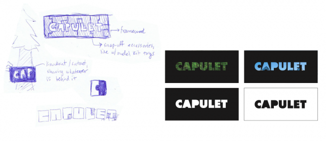
We began with thinking about a new wordmark for Capulet. Our old logo felt pretty tired. We’d outgrown it. One of our colleagues said that “it looks like the logo of a part-time, freelance editor of romance novels”. That’s not far off. To replace it, we were looking for something bold and contemporary. We looked at a variety of options, but this one, with it’s clever play on transparency, felt like the right fit. You can see some of Giant Ant’s early sketches below (click to enlarge):
With a decision reached on the logo, we wanted to extend those ideas with a site that reflected the imaginative, risky work that we do when we’re at our best. The old site’s aesthetic felt a little too corporate and safe for the agency we’d become.
Years ago I read this great manifesto about corporate site design. It contains the simple but powerful idea that companies are mostly just people:
Decide who the Ambassador of your company will be, take a photo of him or her, and put it on the front page of your site to welcome each new visitor personally.
Ever since, we’ve felt that it’s important for site visitors to see who they’re hiring, right on the home page of the site.
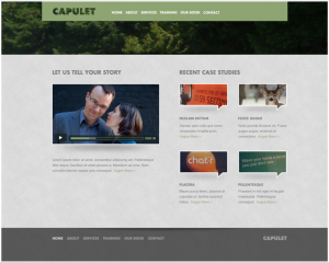
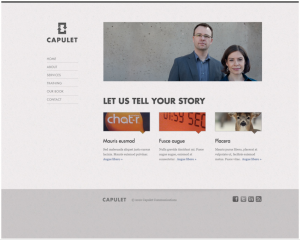
We presented a bunch of ideas to Giant Ant, and cited a couple of sites as inspiration. After agreeing on wireframe layouts, these are a couple of the first drafts we looked at:
We liked them, but we were looking for something a little more brazen. We did some more thinking, and introduced an aesthetic that we figured could help make the design more unusual. It’s a kind of textured, mid-century look that you can find in the wonderful posters of Olly Moss (don’t miss his Star Wars trilogy), and the striking credits sequence in “Catch Me If You Can”:
Based on this feedback, Giant Ant produced a great set of second draft ideas. The current website is remarkably close to one variation of those revisions.
We’re delighted with the result, and hope you like it, too.


