Data Journalism: Elegant and Empowering
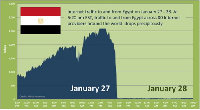
On January 27 at 5 PM Eastern Europe time, the Egyptian Government cut off Internet access across the country. Here’s what the Internet blackout looked like:

An employee at network security company Arbor Networks used data from 80 different Internet service providers around the world to create this image of the Internet block. It’s a simple and elegant example of data journalism.
What is Data Journalism?
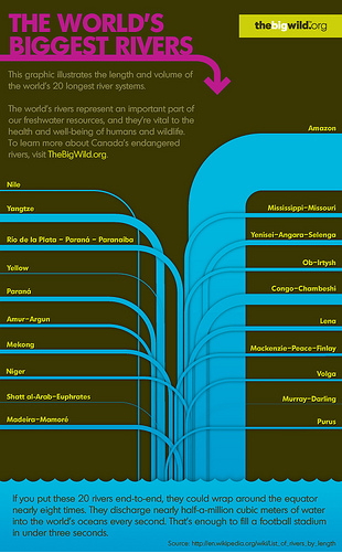
Data journalism presents large data sets in visual ways that readers can understand at a glance. Also known as infographics, the data journalism trend is on the rise and continues to be popular, both in print and on the web. The Guardian’s map of IED attacks in Afghanistan is a another example. As is this infographic we created for The Big Wild and World Rivers Day. It expresses the length and volume of the world’s 20 largest rivers:
If I were a journalist, I’d surely focus on this field. The ability to communicate meaning in a single image is a powerful skill for a world with short attention span. Here’s a nice piece on how to get started on a data journalism project. I also recommend this 54-minute documentary about the rise of data journalism:
